Part 7: Design-quality candidate prioritization
Using affinity-like scoring, complex confidence, interface geometry, and short MD to rank modeled PD-L1 mini-binder candidates.
Previously: Part 6 used molecular dynamics and post-MD fingerprinting to identify which designed contacts persisted after local relaxation across all 28 consensus candidates. This page adds affinity-like scoring and combines the accumulated evidence into a campaign-level prioritization framework.
These scores are not experimental affinities. They are comparative triage features — different lenses on modeled complex quality. The output is a prioritized shortlist of hypotheses, not validated binders.
From persistent contacts to affinity-like scoring
Part 6 asked whether each designed interface remained engaged during molecular dynamics. That analysis showed which contacts survived local relaxation, but persistence alone does not estimate how favorable one modeled interface is relative to another. A complex can remain associated over a short trajectory while still presenting a comparatively small or weakly packed interface.
This stage introduces affinity-like scoring as an additional ranking layer. PRODIGY estimates binding free energy from structural features of a protein–protein interface, primarily the pattern of interfacial contacts together with properties of the surrounding surface. It therefore converts a static complex structure into a comparative predicted ΔG and Kd. For these de novo designs, the useful question is not whether the absolute value is correct, but whether the score helps distinguish stronger modeled interfaces and whether it agrees with the other evidence already collected.
The scoring problem
Of the 55 designs generated, 28 progressed through the complete downstream evaluation sequence: RFdiffusion backbone generation, ProteinMPNN sequence design, ESMFold fold validation, structural filtering, Boltz-2 complex prediction, interface fingerprinting, and 1 ns molecular dynamics simulations. Each of these downstream-complete designs now has metrics from multiple analyses. The question is whether those metrics tell a consistent story — and what happens when they do not.
Five evidence types were assembled across the campaign. Boltz-2 complex confidence asks whether an independent predictor recovers a plausible complex from sequence alone. Static interface geometry describes the physical extent of the minimized interface. PRODIGY adds an empirical affinity-like score. MD-derived metrics test whether the modeled complex remains structurally coherent during short simulation. Post-MD contact persistence measures which designed interactions remain populated over the trajectory.
The first task is to place all 55 designs back into the context of the full screening funnel. That broader retrospective shows where evidence accumulated and where attrition occurred. It is a campaign map, not a final leaderboard.
Pipeline retrospective: all 55 designs
The retrospective matrix reconstructs the full campaign from the original 55 sequence designs. Fourteen quantitative metrics spanning seven pipeline stages are rank-normalized to [0, 1], where 1 is best. Designs that did not reach a stage remain blank, allowing performance, attrition, and evidence coverage to be read from the same figure.
This view is deliberately uneven because the workflow itself is uneven: some candidates were evaluated only through early sequence and monomer-fold screens, while others progressed to complex prediction, interface analysis, PRODIGY scoring, MD, and contact persistence. That makes the matrix useful for visualizing the campaign, but unfair as a single global ranking.
Retrospective pipeline matrix — all 55 designs, rank-normalized
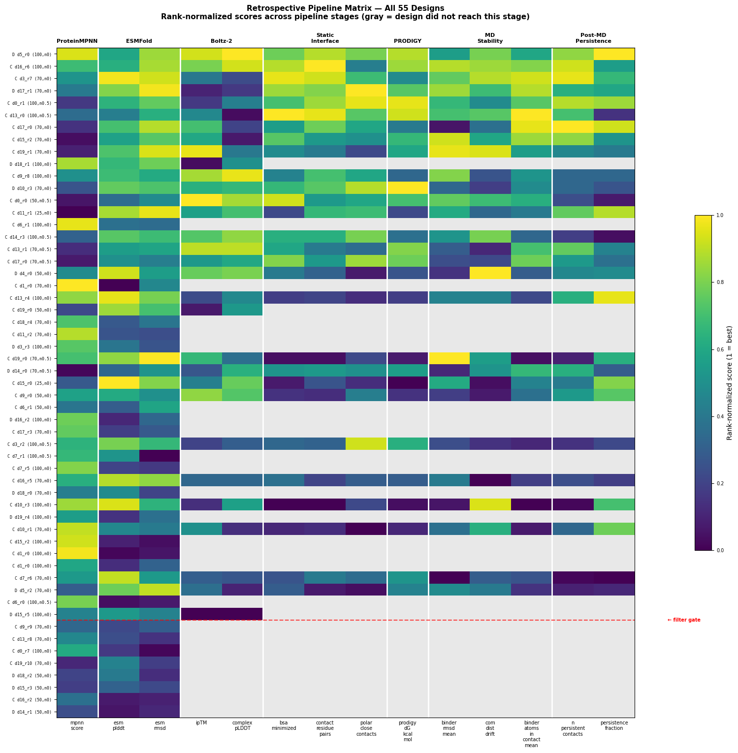
The full matrix should not be collapsed into one leaderboard. A design scored only on ProteinMPNN and ESMFold has not been judged on the same evidence as a design that also completed Boltz-2, static interface analysis, PRODIGY, MD, and post-MD fingerprinting.
Two fair scorecards within an uneven pipeline
To compare like with like, the matrix defines two rectangular scorecard regions. The first uses the low-cost upstream metrics available for all 55 designs. The second uses the downstream evidence package available for the 28 fully characterized designs.
All 55 designs
This scorecard asks which candidates looked strongest after the inexpensive sequence-design and monomer-fold checks.
- ProteinMPNN sequence-design score
- ESMFold pLDDT
- ESMFold RMSD to the designed backbone
28 fully characterized designs
This scorecard asks which modeled complexes remain strongest after the more expensive downstream analyses.
- Boltz-2 ipTM
- BSA, residue contacts, and polar contacts
- PRODIGY ΔG
- Binder RMSD and COM drift during MD
This framing avoids comparing early-stage candidates against downstream-complete candidates as though they had been measured on the same basis. Later in the page, every construct is listed explicitly with its upstream rank, downstream rank, and downstream-completion status.
Before constructing the downstream consensus ranking, I first asked whether the individual evidence layers agree with one another — or whether each stage contributes a distinct signal.
Cross-stage agreement is limited
If every pipeline stage measured the same underlying property, its outputs would be strongly correlated. They are not. Most cross-stage relationships are weak or absent, indicating that the stages contribute partly independent information.
The non-correlations are as informative as the correlations. Sequence confidence, fold recovery, complex plausibility, interface extent, affinity-like scoring, and dynamic coherence expose different failure modes. Two relationships nevertheless stand out: richer static contact networks tend to persist during MD, while PRODIGY affinity rankings largely track interface size.
Static contacts predict dynamic persistence
The strongest workflow-level finding is the relationship between static residue-level contacts and post-MD persistence. Designs that begin with richer contact networks in the minimized structure tend to retain more persistent contacts during molecular dynamics. The Spearman correlation (ρ = +0.679, p = 0.0001) makes static fingerprinting a useful low-cost triage feature before committing to more expensive simulation.
This does not make static geometry a substitute for MD. It means the static screen contains information that survives the transition to dynamics.
PRODIGY largely tracks interface size
PRODIGY predicts binding free energy from interfacial contact features. Across these designs, the rank-normalized PRODIGY affinity score correlates strongly with buried surface area (ρ = +0.825). The practical implication is that PRODIGY contributes less independent information than Boltz confidence or MD stability; much of its ranking is already encoded in interface extent.
The predicted ΔG values span −5.2 to −11.4 kcal/mol, with a mean of −8.2 ± 1.8 kcal/mol. For this workflow, the relative ordering is more useful than the absolute values.
Together, these comparisons show that some metrics reinforce one another while others remain largely independent. The next step is to combine those signals into a downstream scorecard for the 28 designs with complete evidence.
Consensus ranking: the downstream scorecard
The downstream consensus scorecard averages seven rank-normalized features for the 28 fully characterized designs: buried surface area, residue contact pairs, polar close contacts, Boltz-2 ipTM, PRODIGY ΔG, binder RMSD, and absolute center-of-mass drift. Unlike the full retrospective matrix, this is an apples-to-apples ranking: every candidate in this table has the same evidence package.
| Rank | Design | Hotspot | BSA | Contacts | PRODIGY ΔG | RMSD | COM drift | Score |
|---|---|---|---|---|---|---|---|---|
| 1 | len100_clusterA_noise0__design_16_0_rank6 | clusterA | 966.7 | 52 | −10.11 | 1.37 | +0.11 | 0.812 |
| 2 | len100_distributed_noise0__design_5_0_rank0 | distributed | 896.4 | 44 | −10.43 | 1.55 | +0.18 | 0.804 |
| 3 | len100_clusterB_noise05__design_13_0_rank0 | clusterB | 1105.7 | 48 | −10.65 | 1.50 | −0.27 | 0.783 |
| 4 | len50_clusterA_noise05__design_0_0_rank0 | clusterA | 986.3 | 33 | −9.62 | 1.47 | +0.28 | 0.743 |
| 5 | len70_clusterA_noise0__design_3_0_rank7 | clusterA | 1011.2 | 47 | −8.06 | 1.47 | +0.10 | 0.720 |
| 6 | len70_distributed_noise0__design_17_0_rank1 | distributed | 964.4 | 40 | −9.81 | 1.41 | −0.28 | 0.706 |
| 7 | len100_clusterB_noise05__design_0_0_rank1 | clusterB | 868.3 | 41 | −11.37 | 1.51 | +0.51 | 0.672 |
| 8 | len70_clusterB_noise0__design_19_0_rank1 | clusterB | 804.8 | 31 | −8.47 | 1.26 | −0.08 | 0.653 |
| 9 | len70_clusterB_noise0__design_15_0_rank2 | clusterB | 895.2 | 33 | −9.21 | 1.32 | +0.37 | 0.646 |
| 10 | len100_clusterA_noise05__design_14_0_rank3 | clusterA | 850.0 | 34 | −7.76 | 1.56 | +0.18 | 0.635 |
The top 10 span all three hotspot strategies: four clusterA, four clusterB, and two distributed designs. No single hotspot configuration dominates once static geometry, complex confidence, affinity-like scoring, and MD stability are integrated.
Different routes to the top
The richest static contact network among the leaders: 52 residue contacts, 966.7 Ų BSA, ipTM 0.919, binder RMSD 1.37 Å, and minimal COM drift.
Slightly smaller interface, but the strongest overall Boltz confidence among the top three (ipTM 0.941) and a favorable PRODIGY score.
The largest buried interface in the leading trio at 1105.7 Ų, with 48 contacts and strong affinity-like scoring despite lower ipTM than ranks 1 and 2.
The point is not that one metric selects a winner. Similar composite scores arise from different evidence profiles, which is exactly what a useful experimental shortlist should preserve.
What did the downstream analysis add?
The fair comparison is Scorecard 1 versus Scorecard 2: inexpensive upstream rank versus downstream rank after complex prediction, affinity-like scoring, and MD. Designs that did not progress to the downstream scorecard are assigned downstream rank 0.
Across the 55 constructs, 28 reached the downstream scorecard and 27 fell out before complete downstream scoring. The upstream and downstream top-10 sets overlap by 4 designs; the top-5 sets overlap by 2 designs. That means the expensive downstream workflow did not simply preserve the upstream ordering — it materially changed which candidates looked strongest.
Upstream rank versus downstream rank
Lower rank is better. Downstream rank 0 = did not reach the downstream consensus scorecard.
A useful analysis should earn its place in the funnel. It should eliminate weak candidates, materially reorder the shortlist, or add evidence that cheaper stages do not already provide. The broader question — how to balance predictive value against compute cost, scientist time, wall-clock time, and operational complexity — is the focus of the final retrospective.
What this means
The downstream scorecard defines a compact and diverse panel of modeled complexes that have survived multiple independent structural and dynamic challenges. The full retrospective matrix shows how those candidates emerged from an uneven funnel, but the final ranking is restricted to designs compared on the same evidence. That distinction matters: in a practical protein-engineering campaign, rankings are only useful if they support decisions that justify their compute, time, and FTE cost.
At this point, the pipeline has asked whether each sequence can recover its intended fold, form a plausible complex with PD-L1, build a substantial interface, receive a favorable affinity-like score, and retain its interaction network during short molecular dynamics. Those analyses characterize the modeled binder–target complex. They do not yet address a separate question that becomes critical when moving toward experiments: whether the isolated binder sequence looks producible, soluble, stable, and resistant to aggregation.